TECH Signal 501
Smart dual-state dark mode toggle hides system-following complexity from users
 ↗
↗
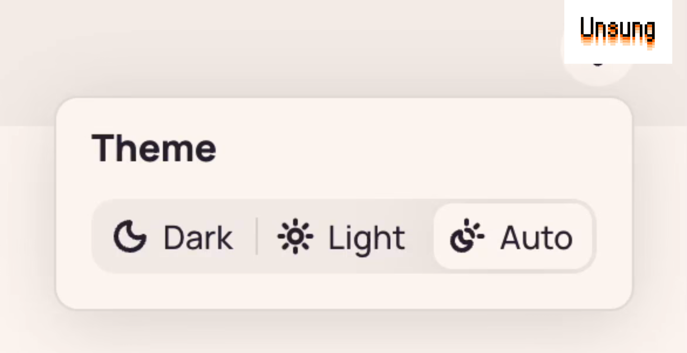
Lea Verou proposes a dark mode toggle with only two visible options, light and dark, where selecting the option that matches the system theme returns the site to following the system, eliminating the need for an explicit third "system" or "auto" state.
Tri-state toggles expose implementation details to users, adding cognitive load for an option that feels different from the other two and is often unclear before interaction. The proposal is a concrete example of abstracting the underlying data model to align with user goals, a principle applicable far beyond dark mode.
Written by elseif from the cluster below · every claim links back to a sourceThe three things worth knowing
A smart toggle shows only light and dark; if the chosen option matches the current system theme, the site reverts to following the system indefinitely, and if it opposes the system, the site locks to that theme permanently.
Verou argues that tri-state toggles are implementation-driven UI, exposing the data model instead of user goals, which is one of the most common UX mistakes.
The article's author finds Verou's explainer itself not fully successful, overlong and with confusing interactive playgrounds, but endorses the underlying proposal and its broader lesson about fighting complexity in small interface decisions.
THE CLUSTER