INFRA Signal 272
Squircles, Styles, and Spacing: How Your Feedback is Helping Improve Mobile
 ↗
↗
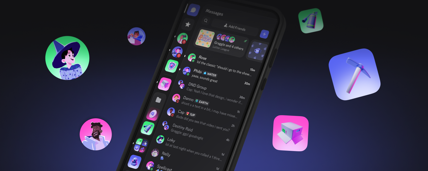
Discord is updating its mobile app to match the visual style and spacing of its recent desktop redesign, bringing back the OG dark theme Ash and adjusting server icons, chat bar layout, and using squircle shapes.
Aligning mobile and desktop reduces the complexity of maintaining separate UI codebases. Consistent spacing and iconography make the user experience smoother when switching devices. The return of a familiar dark theme may affect theme-selection logic and asset pipelines.
Written by elseif from the cluster below · every claim links back to a sourceThe three things worth knowing
Mobile UI now uses squircle shapes and increased spacing to mirror the desktop changes.
Server icons and the chat bar have been adjusted for better visual consistency.
The OG dark theme named Ash is being re-enabled in the mobile client.
THE READ
What elseif makes of it.
The mobile client is being updated to use squircle shapes, increased spacing, revised server icons, a modified chat bar layout, and the return of the OG dark theme Ash, bringing its appearance closer to the recent desktop redesign.
Implementing these visual adjustments will require development time to modify UI components, update asset files, and adjust layout parameters to reflect the new spacing and icon sizes.
Users whose devices or custom themes cannot accommodate the new squircle rendering or increased spacing may not see the full set of changes, and any integrations that depend on the previous icon dimensions or chat bar metrics may need updates.
By aligning mobile and desktop visual language, Discord aims to reduce the effort needed to ship features across platforms and provide a more uniform experience for users switching between devices.
Written by elseif from the cluster below · checked for specifics the sources never containedTHE CLUSTER