WEB Signal 606 3 feeds carried it
CSS media queries and environment variables add dual-screen and foldable device support in Edge
 ↗
↗
New CSS features allow web layouts to adapt to foldable devices by detecting screen segments and hinge geometry in Microsoft Edge
Foldable devices are shipping in growing numbers, but browser support remains uneven. Engineers can now use standard CSS to target dual-screen layouts, yet adoption depends on broader browser compatibility and user demand. The tools exist, but the ecosystem must mature before foldable-optimized web experiences become mainstream.
Written by elseif from the cluster below · every claim links back to a sourceThe three things worth knowing
CSS `horizontal-viewport-segments` and `vertical-viewport-segments` media queries detect foldable device orientation
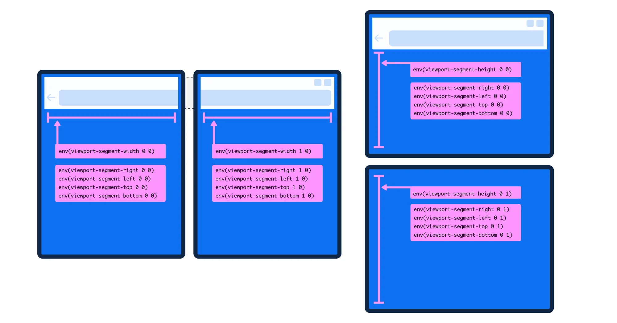
Environment variables like `viewport-segment-width` and `viewport-segment-height` expose screen geometry for layout adjustments
Support is currently limited to Microsoft Edge, with Chrome requiring experimental flags for testing
THE READ
What the cluster adds up to.
The introduction of CSS media queries and environment variables for foldable devices provides a standardized way to adapt web layouts to dual-screen and foldable form factors. These features allow engineers to detect whether a device is held in a book-like (horizontal) or laptop-like (vertical) orientation and adjust content placement accordingly. The environment variables expose the dimensions of each screen segment, enabling precise control over how content spans or aligns with the hinge. This eliminates the need to hardcode layouts for specific devices, reducing fragmentation in the foldable device market.
Adopting these CSS features requires minimal changes to existing responsive design patterns but demands awareness of the new properties. Engineers can use familiar tools like CSS Grid and Flexbox, augmented by the new environment variables, to create layouts that dynamically respond to the device’s physical configuration. However, the lack of widespread browser support, currently limited to Microsoft Edge, means that production use is constrained. Chrome’s experimental support via flags suggests future adoption, but until stable releases include these features, cross-browser compatibility remains a barrier.
The practical value of these features depends on user behavior and device adoption. While foldable devices are shipping in increasing numbers, they still represent a small fraction of the overall mobile market. Engineers must weigh the effort of implementing dual-screen layouts against the potential reach of their audience. For applications where multitasking or split-screen use is critical, such as productivity tools or media consumption, these CSS features could enhance user experience. However, for most general-purpose websites, the return on investment may be limited until foldable devices gain broader traction.
The uneven browser support highlights a chicken-and-egg problem in the foldable ecosystem. Without robust browser and OS support, developers are unlikely to prioritize foldable-optimized experiences, which in turn reduces the incentive for browsers to implement these features. Microsoft’s early adoption in Edge provides a testing ground, but widespread use will require alignment across major browsers. Engineers should monitor browser updates and user analytics to determine when foldable support becomes a worthwhile investment for their projects.
Written by elseif from the cluster below · checked for specifics the sources never containedTHE CLUSTER