TECH Signal 370
With Siri AI enabled, iOS 27 moves Notification Center to the top-left corner
 ↗
↗
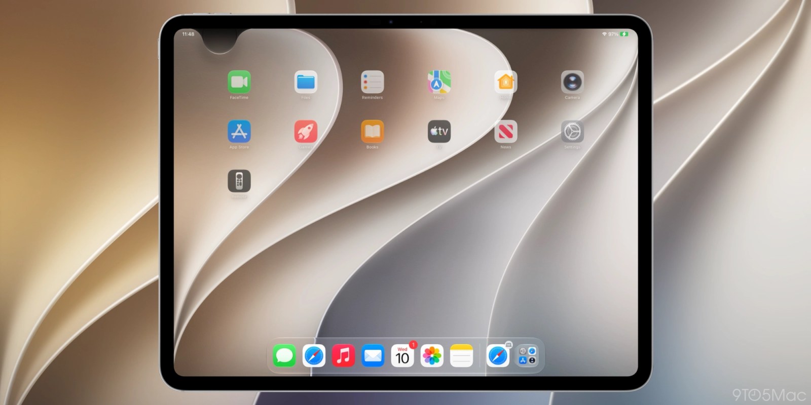
iOS 27, currently in beta, changes how Notification Center is opened on iPhone and iPad when Siri AI is enabled, moving it to a top-left corner swipe and giving the top-center swipe to Siri AI.
For users who enable Siri AI, the familiar top-edge swipe that opened Notification Center for 15 years now invokes Siri AI instead. Notification Center is still accessible from the top-left corner, but the change forces new muscle memory and there is no setting to disable it. The behavior has shifted between betas, so the final gesture layout may still change before release.
Written by elseif from the cluster below · every claim links back to a sourceThe three things worth knowing
Enabling Siri AI in iOS 27 reassigns the top-center swipe from Notification Center to Siri AI on iPhone and iPad.
Notification Center remains accessible via a top-left corner swipe, with alerts animating in from that corner.
The change is present in the sixth developer beta and is expected to ship this fall, with no option to disable the new Siri invocation gesture.
THE READ
What the cluster adds up to.
iOS 27, currently in beta, reassigns the top-edge swipe gesture on iPhone and iPad when Siri AI is enabled. Swiping down from the center of the top edge now invokes Siri AI instead of opening Notification Center, which has been the behavior since iOS 5 in 2011. Notification Center is still available, but only from a top-left corner swipe, and alerts now animate in from that corner. This is a deliberate move to prioritize Siri AI access, with the majority of the top edge devoted to the new Siri experience.
For users who enable Siri AI, the change breaks 15 years of muscle memory. The article notes that there is no option to disable invoking Siri from the top-middle swipe, so the only workaround is to build new habits around avoiding the center. The author, who has used the new behavior for months, says they would toggle it off if a setting existed. This is a significant UX disruption for a feature that many users access frequently.
The gesture layout has shifted between the first two beta releases. In iPadOS 27 beta 1, the area above Home screen app icons was almost entirely devoted to Siri AI, and the Notification Center region shrank if you disabled the AM/PM or date display. Beta 2 improved this with a more uniform region, roughly the size of two app columns, with Notification Center on the left and Control Center on the right. The sixth developer beta still shows the change shipping this fall, but the exact boundaries may continue to adjust.
This is not the first time Apple has moved a system gesture. The article recalls that Control Center moved from a bottom swipe to a top-right corner swipe on iPhone X, and later unified across devices. Now Notification Center is being put in the corner, following the same pattern. The trade-off is that Siri AI gets prime real estate, but at the cost of a long-standing interaction pattern. Early feedback on Siri AI itself is positive, which may soften the blow, but the gesture change remains a point of contention for those who rely on quick notification access.
Written by elseif from the cluster below · checked for specifics the sources never containedTHE CLUSTER